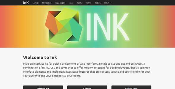
Ink is an interface kit for quick development of web interfaces, simple to use and expand on. It uses a combination of HTML, CSS and JavaScript to offer modern solutions for building layouts, display common interface elements and implement interactive features that are content-centric and user friendly for both your audience and your designers & developers.

Free Web UI Kit
Web User Interface Kit

Free Web UI Kit
Features
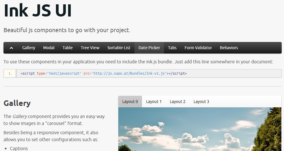
Gallery
The Gallery component provides you an easy way to show images in a “carousel” format.
Besides being a responsive component, it also allows you to set other configurations such as:
- Captions
- Thumbnails
- Images’ maximum width and height, in the full and thumbnail version
- Type of Layout
Modal
The Modal component was designed to replace the common/native modal boxes that browser have, providing some features:
- HTML formatted messages
- Configuration of height and width of the modal
- Remove the dismissing through the ‘x’/close button. Particularly useful if you want to define another button to do the dismissing
Table
The Table component ease the process of improving a regular table element with some features like:
- Pagination
- Sorting
- Loading through AJAX (via an endpoint)
Sortable List
The Sortable List component transforms the rows of a list in draggable/droppable items inside of the list.
By doing that, allows the user to sort the order of the list.
Date Picker
As the name says, the Date Picker transforms a textbox into an element that, when in use, shows a calendar to help selecting a specific date.
Tabs
The Tabs component allows you to implement a tabbed UI, where each container is displayed as it’s related tabbed is selected.
Form Validator
The FormValidator component provides an easy way to validate forms before submitting them. It can:
- Detect required fields
- Validate some field types
- Detect match with password and confirmation password
- Use custom field types
Basic alert box design
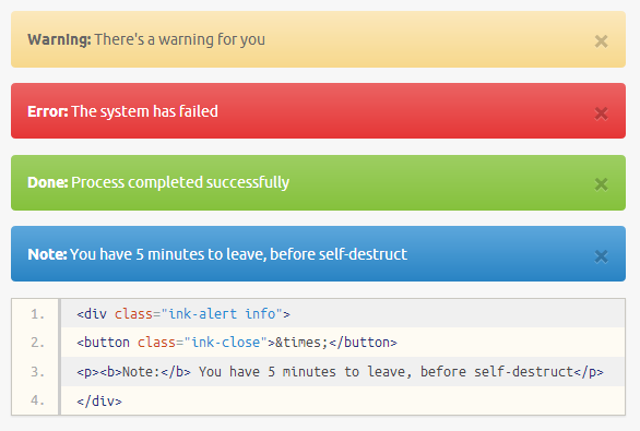
Basic alerts are useful for simple interaction with the user, such as showing a state on a web application or giving a warning on a form.
To style some text as an alert, create a block element, such as a div, with the ink-alert class. This creates the outter shell of the alert, so to speak. To add some meaning, using color, add one of the following classes:
errorfor error messagessuccessfor success messagesinfofor informative messages
Add a <button> element with the class closeand an appropriate icon (Ink uses the ×character), to add a simple dismiss action to your alerts.

Alert Box Design
Horizontal menu
To build a horizontal menu with ink start with a block-level element and use the ink-navigation class. We prefer to use a <nav> tag to wrap our navigation items, but a <div> will do just fine.
The menu itself is built with a unordered list with the menu and horizontal classes. Adding color is as simple as adding a class to the menu list element. Available classes are grey, green, blue, red, orange and black!

Horizontal Menu
Getting started
Let’s get you started with Ink right away. Here’s what you need to know and do:
- Download latest build.
- Open
my-page.htmlif you want to serve Ink from your host ormy-page-cdn.htmlif you want to serve Ink from our servers. - Check the template we provide and remove whatever you don’t feel necessary for your project.
- Make sure you have
ink.css,ink-ie.cssandink.jsincluded somewhere in the<head>. - Add your own stylesheets and scripts to carry all your project-specific changes.
see more - http://ink.sapo.pt/index.php